HRLocker

Visual identity assets

This webpage provides guidance for creating consistent and recogniseable visual communications on behalf of HRLocker. You will find the artwork asset downloads you need, in a range of suitable file formats, with guidelines for their preferred application.

Brand

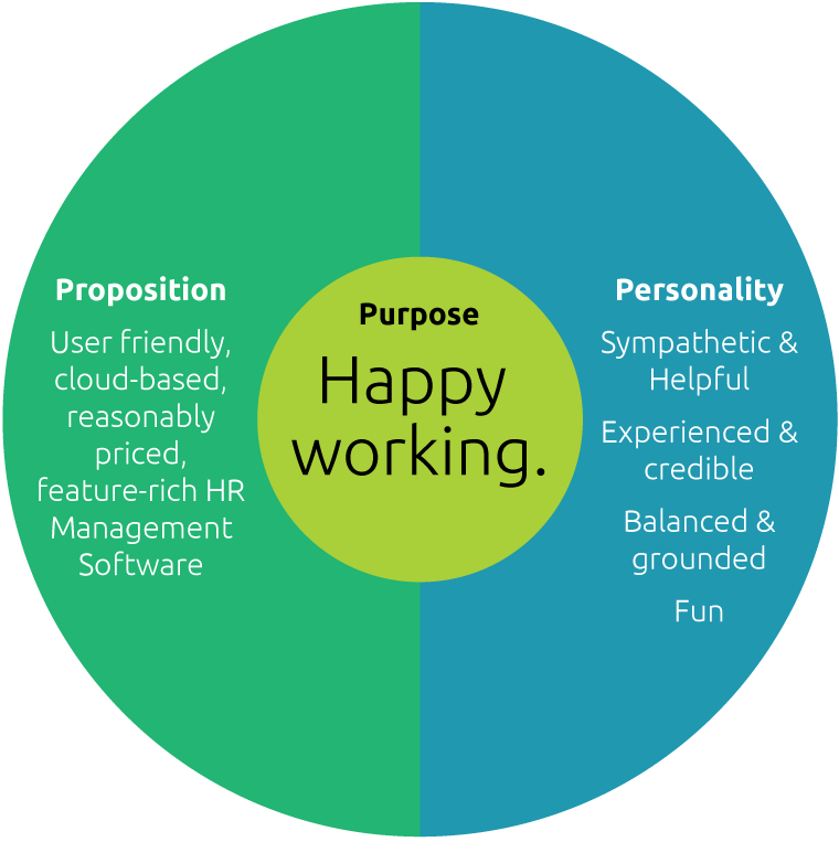
Our brand is more than just a logo, it is our reputation, and it informs our decision-making process, and our actions. It is defined by three principles: Proposition (What we do?), Personality (How we do it?) and Purpose (Why we do it, and why should anyone care?).

Our Proposition: User friendly, cloud-based, reasonably priced, feature-rich HR Management Software

Our Purpose: Happy working.

Our Personality:

  1. Sympathetic & Helpful
  2. Experienced & Credible
  3. Balanced & Grounded
  4. Fun
The three P's of our brand

Typography

Ubuntu is our brand font. It is available to download for free from Google fonts, making it suitable for use in printed communications and online user-interfaces. It comes in a range of weights, and has great legibility at small sizes. Note: Please do not use Condensed or Mono versions of Ubuntu.

Arial is our fall-back font. Use Arial in situations where you cannot confirm that Ubuntu is installed on the recipient computer - e.g. email communications, or Microsoft office presentations, spreadsheets and documents.

Get Font
Type specimen

Colour

Our brand colour palette consists of 2 colour groups.

  1. Core colours: Start with these colours. Note the proportions of each wedge - CTA (Call to action should be used sparingly, with the purpose of drawing the reader's eye to our call to action. Greys: For text, and background colour fills.
  2. User interface colours (TBC): IMPORTANT - These colours are for use on our product user interface only, and should not be used in promotional communications.

Please also give consideration to generous use of white as a background colour. This ensures that our communciations are clear, bright and elegant.

Colour values: Green C76 M0 Y75 K0, R34 G181 B115, #22b573. Lime C39 M0 Y99 K0, R169 G207 B57, #a9cf39. Teal C78 M24 Y26 K1, R32 G152 B176, #2098b0. CTA C2 M96 Y28 K0, R232 G38 B114, #e82672. Dark Grey C1 M1 Y1 K85, R76 G77 B79, #4c4d4f. Mid Grey C1 M1 Y1 K25, R196 G196 B197, #c4c4c5. Light Grey C1 M1 Y1 K5, R237 G237 B237, #ededed.

Imagery

When promoting our business, we use photography and video to visually express the HRLocker customer experience. The preferred style of imagery is naturalistic and reportage in full colour with bright, natural lighting. Images should show the face(s) of the subject(s) either at a straight or three-quarter or side on angle (i.e. never from the back), with the focus being on one or two subjects at any time. The subject shoiuld ideally be shown interacting with our product. Image locations can range from the office, to on-the-go situations, to leisure time. Images should be gender-balanced with a good range of ethnicities and age groups to reflect the profile of our customer base.

Here are some things to avoid:

  1. Montages of multiple photographs.
  2. Overly-staged photographs where subjects are looking to camera or grinning ingenuinely.
  3. Photographs containing c.g.i
  4. Filtered, treated with a colour hue or grey-scaled photographs.

Reasonable priced royalty-free images can be sourced from iStock photo or Shutterstock. Click the link below to see some sample stock images, which are available to license.

Stock imagery
Sample images

Colour margin

This is a graphic embellishment, which creates further recognition of our promotions and communications. It consists of a narrow rectangle which is divided into three equal parts along its long side. The parts are then coloured in the following order: Top-bottom Lime > Teal > Green, or Left-right: Lime > Teal > Green. The colour margin should extend across entire length of one side of the page (i.e. Top-bottom or Left-right),and it should ideally be positioned next to the image, or on the opposite side to the HRLocker logo. The width should be no greater than 2% of the corresponding page dimension.

Icons

Icons play an important role in creating great user experience by communicating our product features and functionality in an accurate way, with personality. It is important that our icons are consistent in style. Based on an icon, which is (approximately) fits within a 30px radius circle, we suggest the following:

  1. Key strokes are coloured Dark Grey
  2. Key stroke weights are set to 2px with rounded caps and corners.
  3. Key strokes are broken at one or two intervals (where appropriate) to create a sense of depth.
  4. Fill colours are limited to Lime, Teal and Green
Download icons
HRlocker icons

Language

The Tag line ‘Happy working.’ is optional, and should be used when there is no opportunity to typeset 'Happy working.' as part of your sign-off. Always typeset the term 'HRLocker' in Capital-case, with 'HRL' set in caps. There is no space between HR and L when typesetting HRLocker.

In action

The following are examples of how it all comes together. These are examples of YouTube adverts for different stages of our customer journey. More examples to follow as they are created.